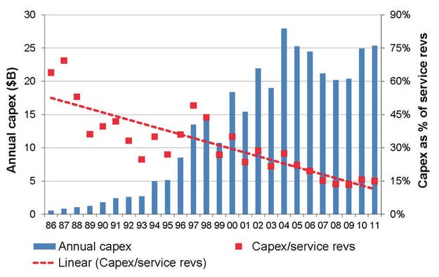

And why it's so expensive, and why we don't all have 4G yet, and why we still get that roaming icon so much, etc. The red line represents carriers' spending on network infrastructure over the years, relative to revenues. It's still declining despite, like, everybody getting network-straining smartphones.