
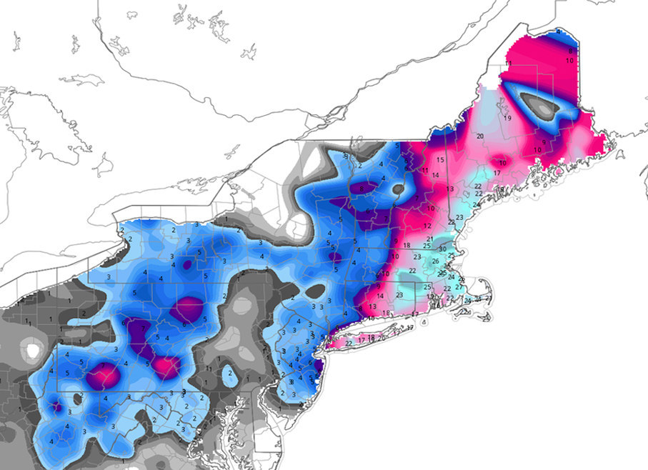
This week's "historic storm" didn't pan out as expected, and these maps show the difference between forecast and reality:
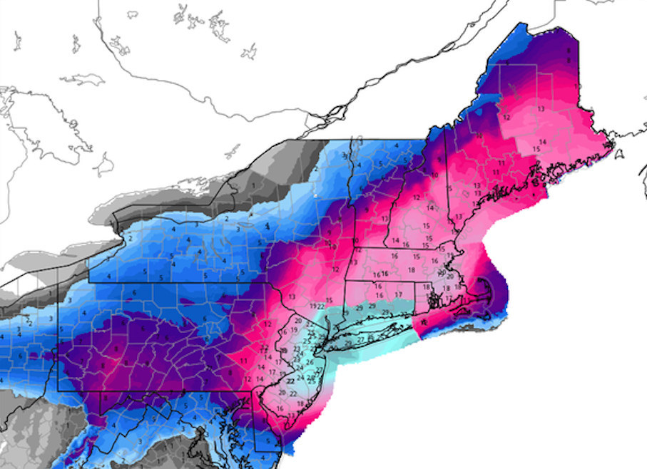
The map on the left was generated Sunday and shows how much snow the National Weather Service expected across the Eastern Seaboard. The teal-colored areas represent the most intense snowfall, and show how forecasters expected nearly 30 inches in New York City.
The map on the right was produced Wednesday and shows what really happened during the storm: the intense snowfall ended up further north and east, near Boston.
Both maps were created by WeatherBell Analytics, an independent weather firm, using NWS data. Ryan Maue, a meteorologist with WeatherBell, explained Tuesday why forecasters were so far off with their predictions.