This GIF shows just how much the number of refugees seeking shelter and asylum in Europe and the Middle East has grown since 2011, when the Syrian civil war broke out.
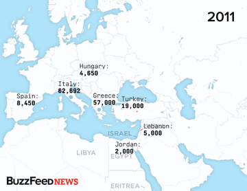
The map isn't meant to be comprehensive or fully explain the crisis — it leaves off, for example, the Syrian refugees in Egypt or refugees permanently resettled in Germany and Scandinavian countries.
It also isn't meant to say that there are no refugees aside from Syrians attempting to enter Europe — many of the refugees coming into Italy are from Eritrea. And it focuses on the what the United Nations refers to as spontaneous movement of refugees rather than planned resettlement like is currently being discussed in the United Kingdom.
But this map — drawn from data from the Office of the UN High Commissioner for Refugees, the European Union's Frontex border patrol, and the International Organization of Migration — does show that each year, the number of people trying to reach Europe has been increasing, causing the total since 2011 to swell before hitting the peak that we're now seeing. In some cases, the number of those attempting to cross the border has doubled from year to year.
On the European side, until recently the focus has been on refugees arriving by boat, after they'd made the sometimes deadly voyage across the Mediterranean from Turkey or Libya.
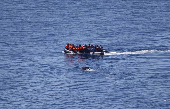
Now refugees have in larger and larger numbers been making their way into the interior of Europe, setting off a string of confrontations like the one seen in Macedonia last week and Hungary on Thursday.

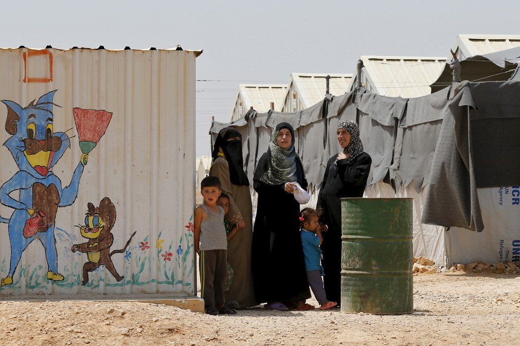
And as the red dots on the map shows, the situation hasn't gotten any easier over time for the countries neighboring Syria that have accepted almost a quarter of the Syrian population into their borders since 2011 even as funding has plummeted.
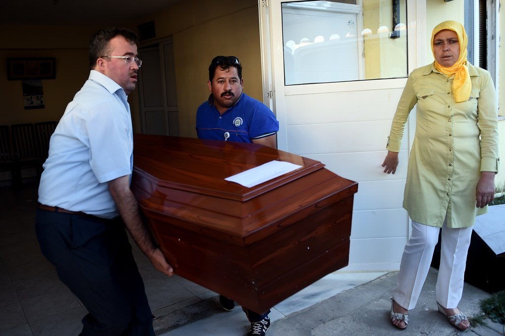
After a photo of a Syrian boy who drowned while trying to reach Europe prompted shock worldwide, Europe's leaders are facing increasing public pressure to address the growing crisis.