

Since last summer, Google's been waging a war on email.
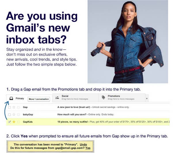
It started with tabbed inbox, Google's first attempt to consolidate the service. The change left third-party email clients flat-footed and out of sync with Google's newly organized system. More than anything else though, it sent a definitive message to email marketers: Google was taking back control of the inbox. Advertiser emails would be redirected to the "Promotions" tab, effectively changing the way they would be perceived by users.
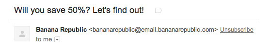
Naturally, email marketers got nervous. They started sending emails like this, desperately trying to nudge their way into the coveted "Primary" inbox:
The second part of Google's offensive came last month in the form of an "unsubscribe" action button on emails inside the "Promotions" tab. It was a bold placement choice by Google. Some saw it as "Big Email" bullying advertisers and basically inviting users to unsubscribe. Google framed it as an attempt to "empower users," but the end result was clear. Google was forcing email advertisers to increase the quality and relevance of their messages.
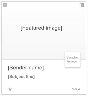
This week, Google announced yet another change to the "Promotions" tab, rolling out a new visual grid template. It looks a lot like a Pinterest page, offering up large images attached to a company's logo and the subject line of the email. Here's how Google describes it on its official Gmail blog:
Promotional mail has a lot of images, from pictures of snazzy new shoes to photos of that rock-climbing gym you've been wanting to try. But right now, those images are buried inside your messages—and with only subject lines to go on, it can be a challenge to quickly pick out the deals and offers that interest you most. To help you find what you're looking for faster, you can now sign up for a new field trial for Gmail that lets you view the Promotions tab in a more visual way.
Right now the grid system is part of a "field trial," which users can sign up for here. Once enables, it can still be toggled on and off, so you're not stuck with the redesign.
At first glance, this feels like a peace offering of sorts from Google. The quick rise of tabbed inbox hasn't killed email marketing as many advertisers feared when it was announced, but it did catch advertisers unaware, forcing them to — for lack of a better word — beg for primary placement. More importantly, it was a directive from Google for email marketers to "do better" without really offering any tools to help them accomplish that goal. That is, until now.
Regardless of what you think of the new grid layout — it's undeniably busy and a complete reimagining of a space that's remained virtually unchanged for over two decades — it's hard not to see this as a savvy move on Google's part. In one move, the company has tossed an olive branch to an active community it's been battling for the better part of a year. It's also a sneaky maneuver that puts even more of an onus on advertisers to stop spamming and create email that's actually visually appealing. Here's what the advertisers' email template will look like, according to the email marketing company Litmus:
In this sense, it's just the latest push in Google's larger war on email. Whether users respond positively or not, it makes tabbed inbox a friendlier place and maybe even a tiny bit enjoyable (all bets are off if this becomes a default feature for primary inbox).
Google still has a long way to go — the inbox is far from a place you want to go — but at least now they'll have email marketers on their side.