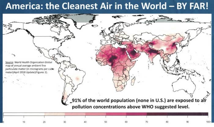
Seemingly apropos of nothing, President Donald Trump tweeted this graphic out on Monday, claiming that the US has “the Cleanest Air in the World — BY FAR!”

“America: the Cleanest Air in the World - BY FAR!”
Trump has claimed time and again during his administration — even as he’s overturned environmental regulations left and right — that he’s in favor of “clean water and clean air.”
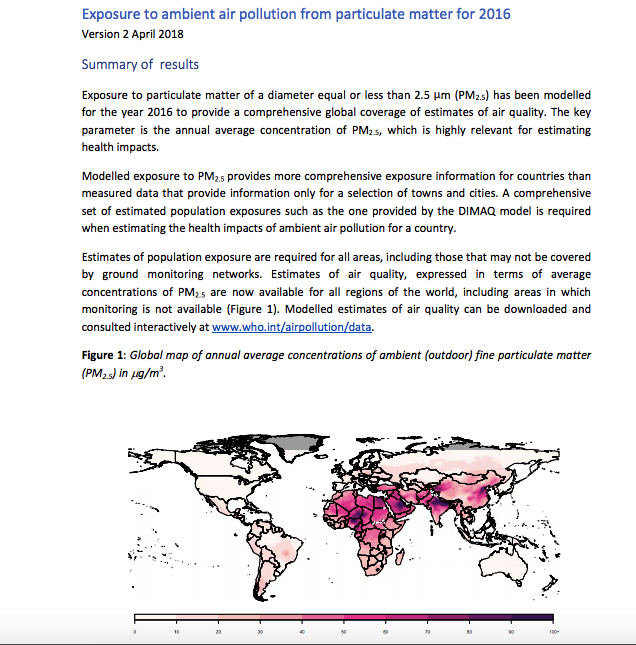
Taking a closer look, the image in Trump’s tweet cites a World Health Organization map for the data. The “(none in U.S.)” appears to be a new addition to the original map.
After sifting through several WHO maps, we came across this one.
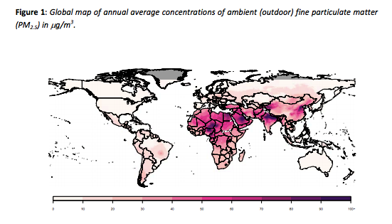
The colors are a little different, but the data is the same, so problem solved, the tweet is correct, right? Wrong, for a few reasons.
1. As John Walke, a former EPA official and currently with the Natural Resources Defense Council (NRDC), tweeted, the claim that the US is totally free of people exposed to high levels of air pollution is, well, not right.

This map is based upon the same @WHO data. It clearly shows areas in the U.S. with average annual PM2.5 pollution concentrations above the WHO air quality guide level of 10 ug/m3 (darker green). https://t.co/6J8MbAC7J5 13/ https://t.co/AavcrKeLWX
There are 45 US cities with fine particulate matter levels above WHO’s suggested level of 10 micrograms per cubic meter, such as California’s Bakersfield and Los Angeles, according to Walke.
And per the American Lung Association’s latest annual State of the Air, while 11 of the 25 most polluted cities in the US improved their quality under US standards, all 25 “failed to meet the more protective standards established by the World Health Organization.”
2. What’s more, the map’s data isn’t as recent as the label in Trump’s tweet would have you think. Instead, it comes from the WHO’s report titled “Exposure to ambient air pollution from particulate matter for 2016.” Again: 2016.
3. The year the report came out, this guy was president, with all the regulations that came along with his administration.
4. Pollution got worse in 2017. Check out this graph, which shows that the amount of pollution in the air last year was actually higher than it was from 2012–16, though still below other past years.

President Trump again claims air is cleanest it has ever been. Check this out from EPA. This is PM2.5 or dangerous fine particle:s 2017 unhealthy days > 2012-2016. A fact check here: https://t.co/iz3uyI4ZOz https://t.co/rsbOlVPMkw
5. Let’s not forget that in the past two years, the Trump administration has started to roll back numerous regulations designed to protect the air, including standards on car pollution.

6. Oh, and Finland actually boasts the best air in the world. That’s according to the same WHO data.