
LinkedIn Maps
This one looks like a jellyfish, and it's one of the better graphs we've seen. If you've got a LinkedIn profile, you can try it out yourself.
The Standard Issue Facebook Graph
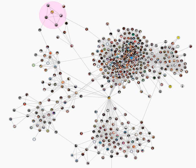
This one looks like an erector set gone wrong — which is the look Facebook usually goes with when they're trying to explain the Open Graph.
Nexus
Sometimes, your network looks like a Plinko board, at least according to this (sadly defunct) Facebook app from Paul Irish.
CurlGraph
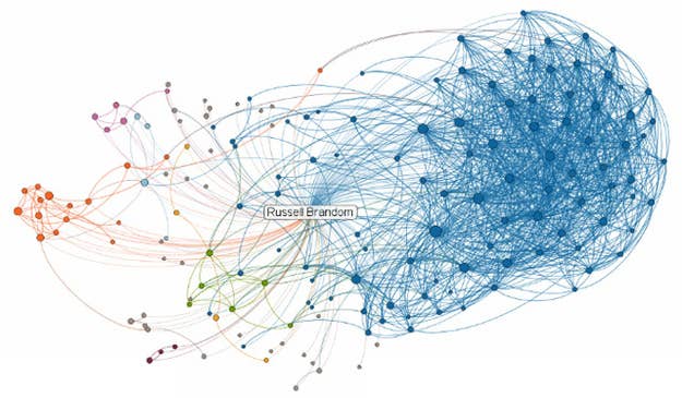
NameGenWeb
This is most computery of the bunch, either an air traffic control screen or some kind of DOS-era war game. Try it out if you like.


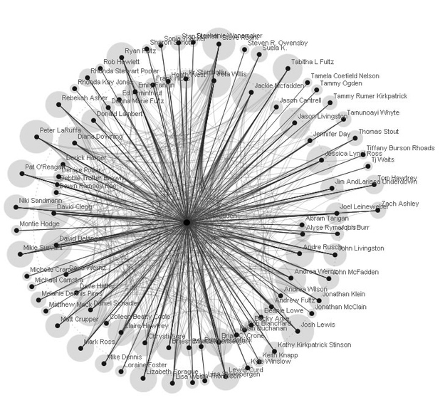
It's full of stars.
MentionMapp
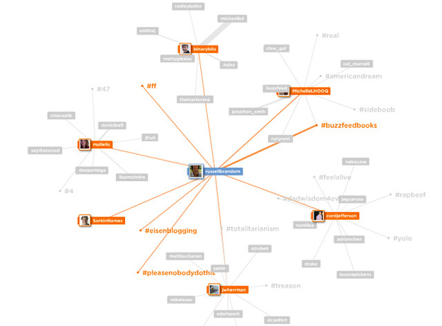
This Twitter map has been stripped down until it looks like a chandelier.
Recollect
If it gets complex enough, the graph starts to look like a cloud, like this map of tweets and re-tweets from Recollect. Explore it here, or sign up to build your own once it comes out of beta.
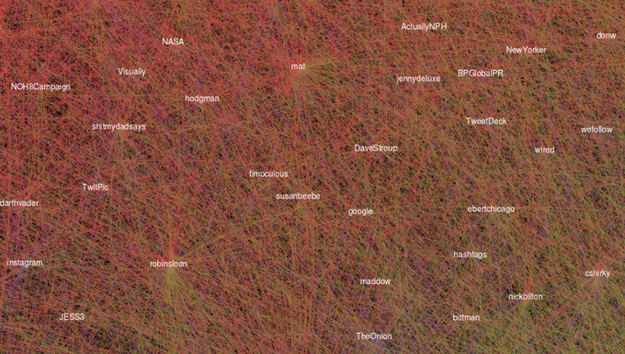
A closer look.
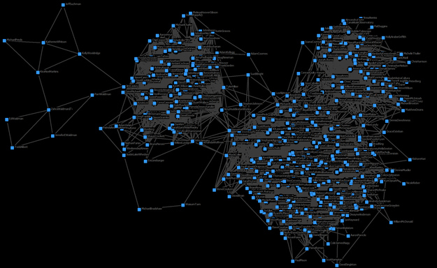
The Homemade Twitter Graph
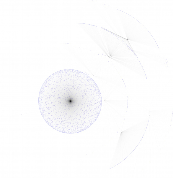
If you give it enough space, the graph starts to look astronomical, like planets or satellites in orbit, as in this open-source Python project from Martin Laprise.
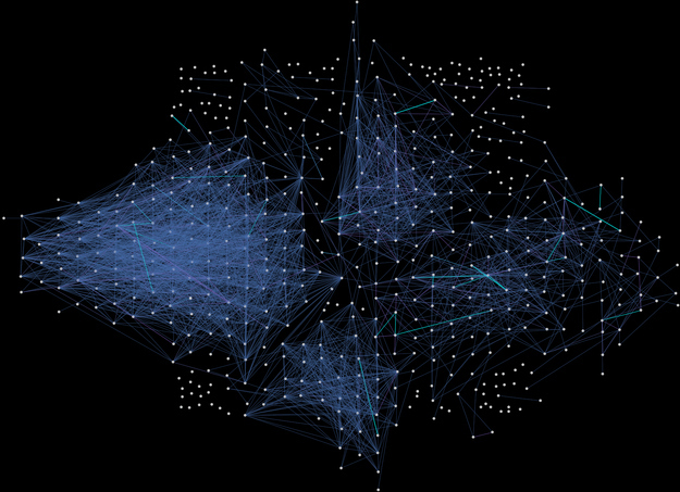
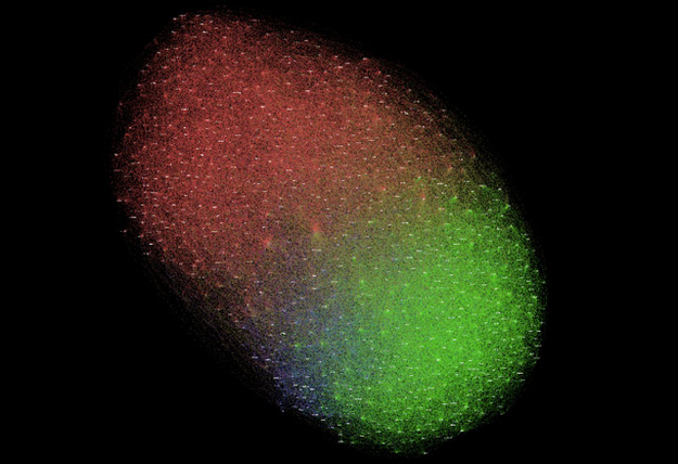
The Complete Facebook Map
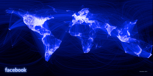
Or maybe it's just the Earth?