
Google Image results for "jcpenney logo"

J.C. Penney confirmed Wednesday that it's returning to its former logo of "JCPenney" written out in red, Helvetica font, which will be the struggling company's third logo change in less than three years. This one was last used in early 2011.
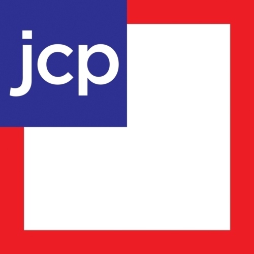
The retailer is scrapping the "JCP" inside a square that former chief executive officer Ron Johnson championed and is skipping past another "bold" logo iteration introduced under current chief Mike Ullman in February 2011.
J.C. Penney, which has been looking to undo mostly disastrous changes made by ex-Apple retail chief Johnson during his 17-month tenure at the company, told AdAge yesterday that customers "overwhelmingly confirmed their preference for our classic J.C. Penney logo" in recent consumer research.
Maybe this one will stick.
This is the logo J.C. Penney is bringing back

And the latest one introduced under Ron Johnson in January 2012
And the one rolled out in February 2011
