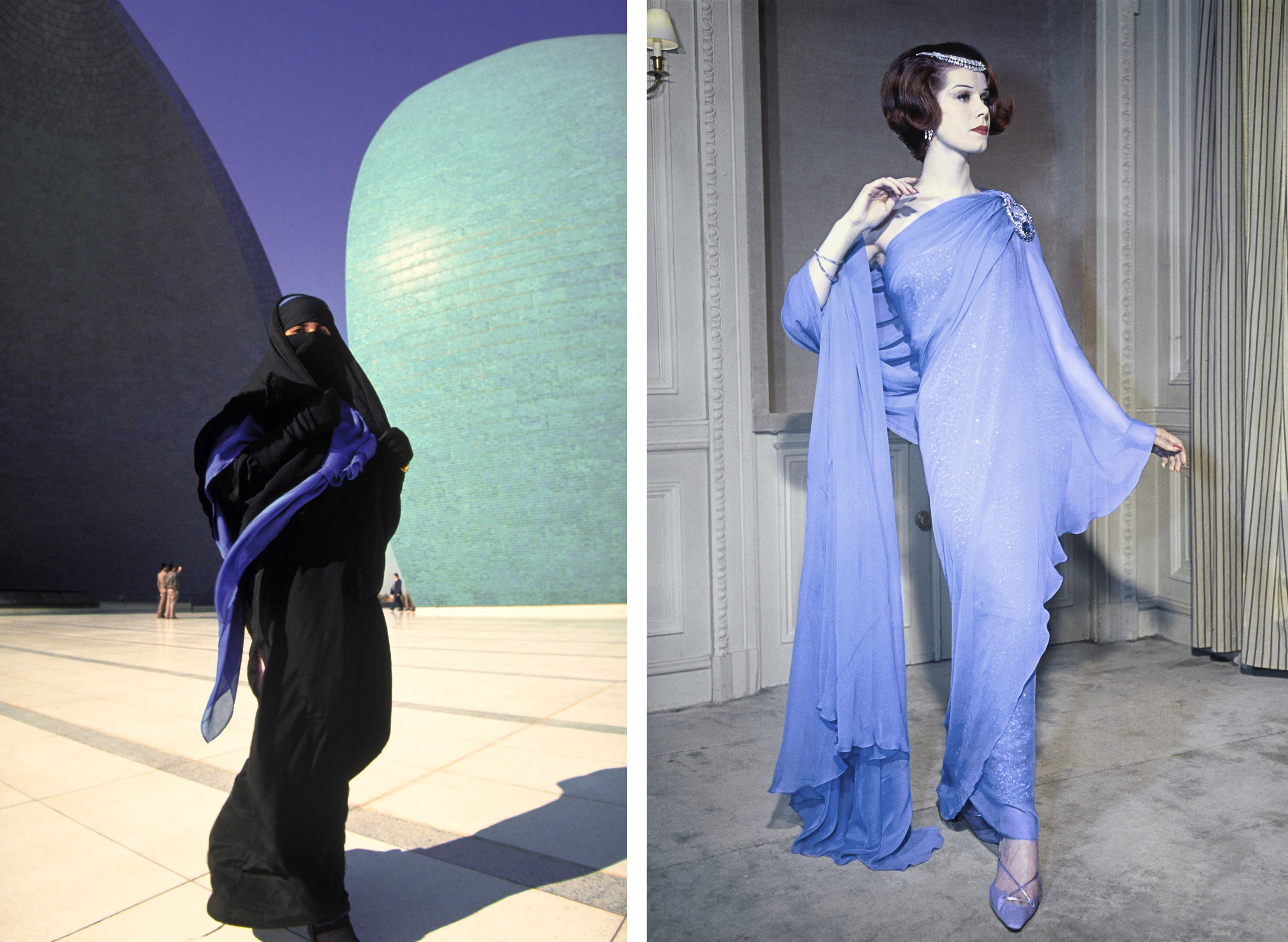
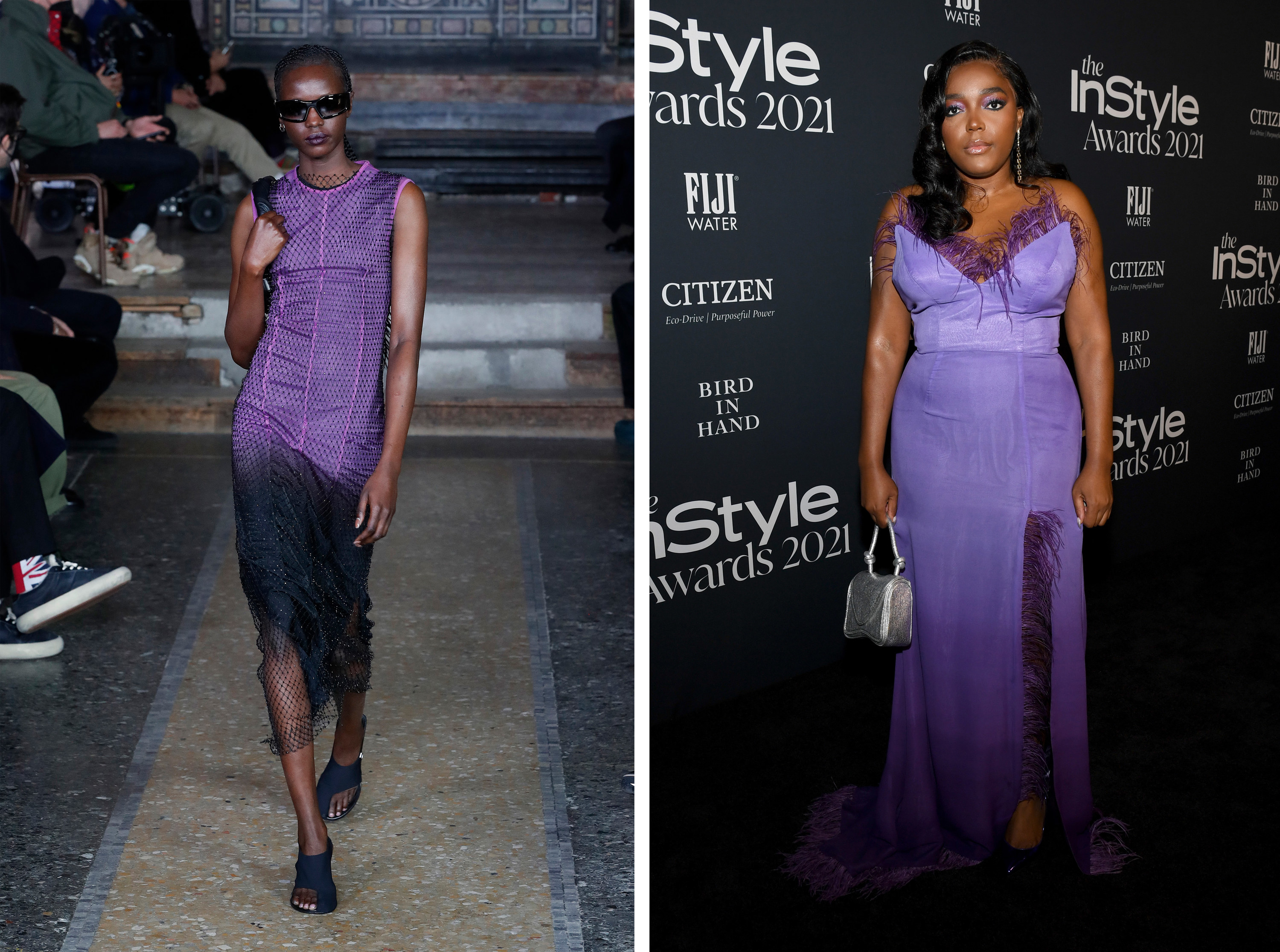
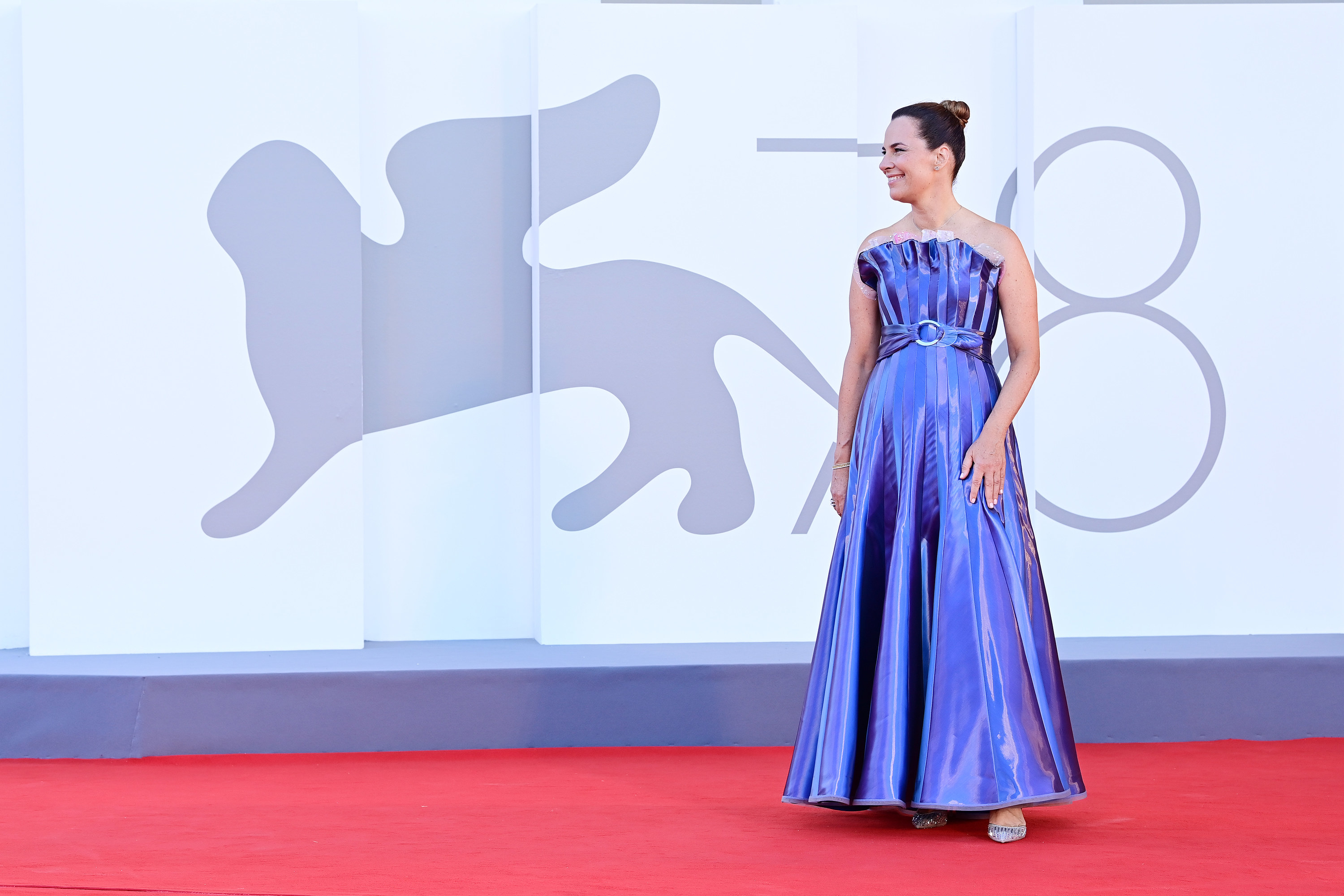
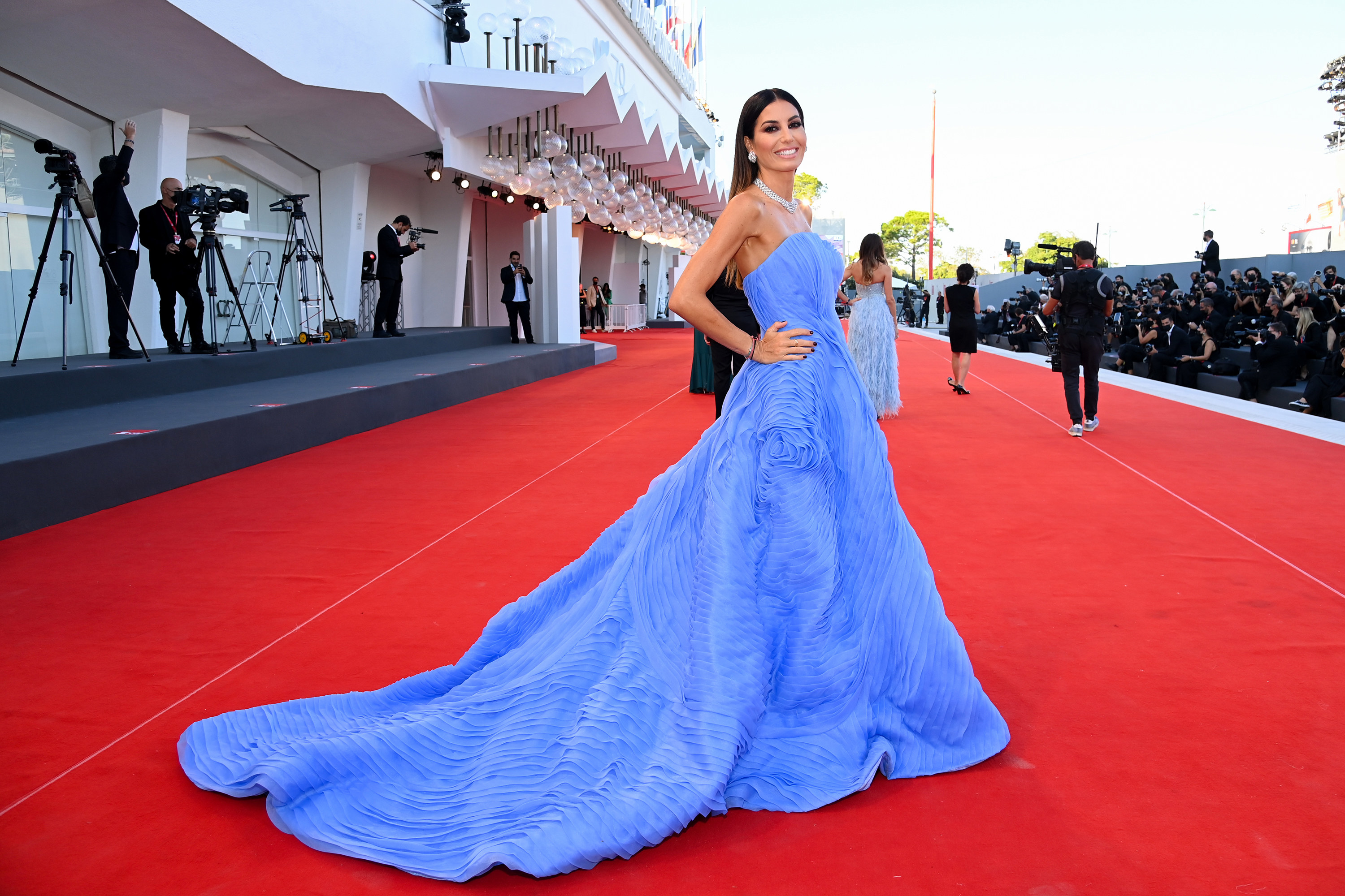
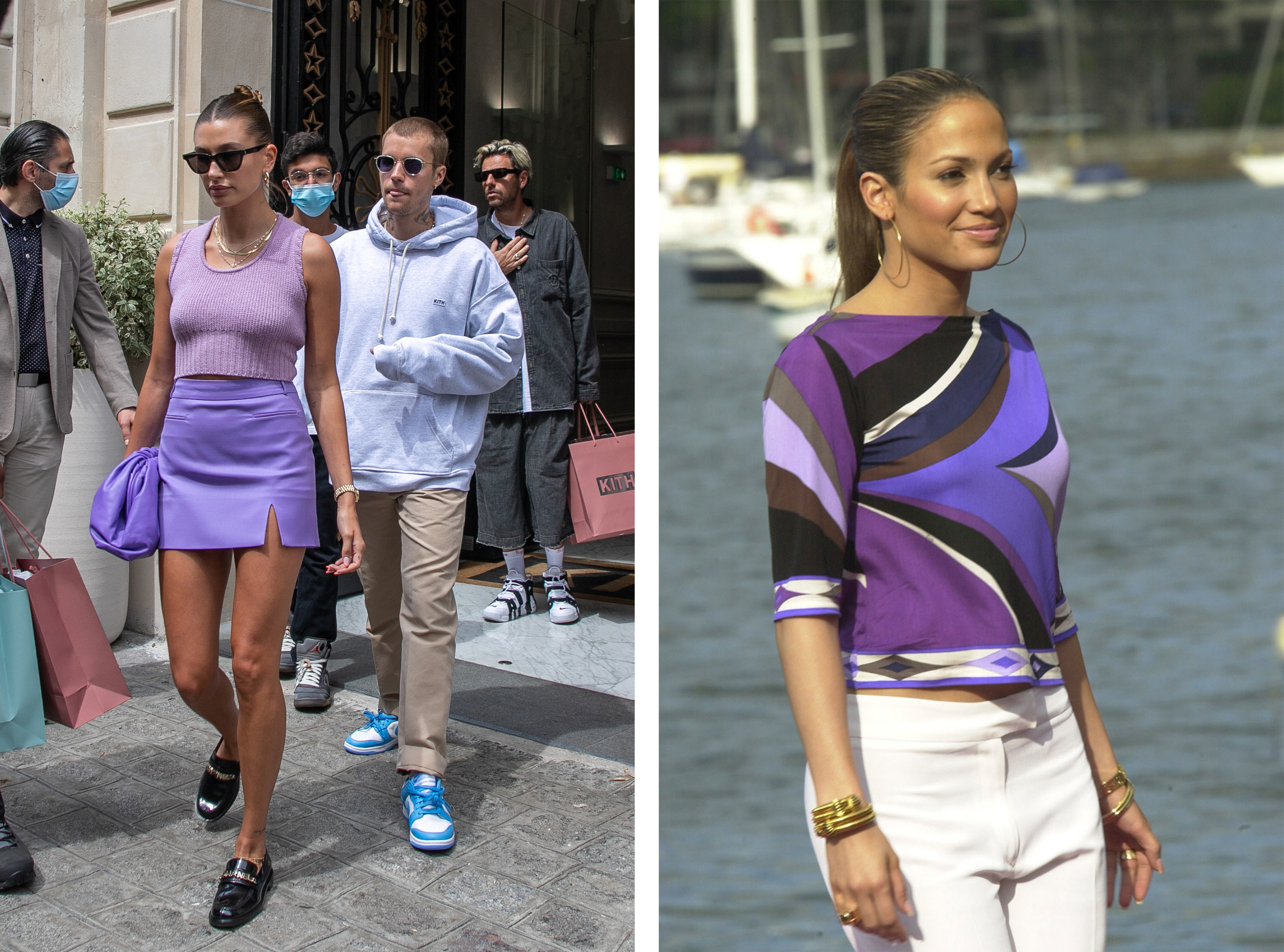
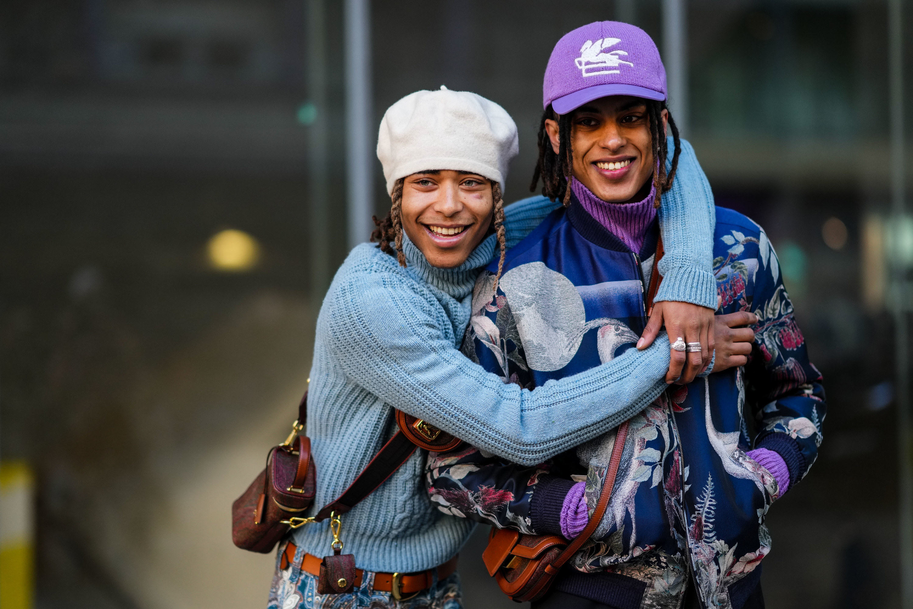
How much do I love periwinkle? Let me count the ways. Pantone, a color matching company now widely considered to be a fashion industry tastemaker for its color trend forecasts, announced its color of 2022 in early January. Pantone #17-3938, Very Peri, is a purply blue lavender hue, and Pantone predicts that the color will influence what we will buy, what we wear, and what we find appealing before we even know why we're attracted to it.
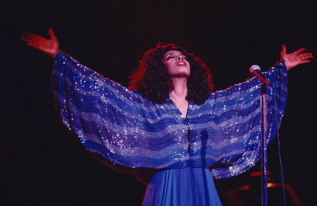
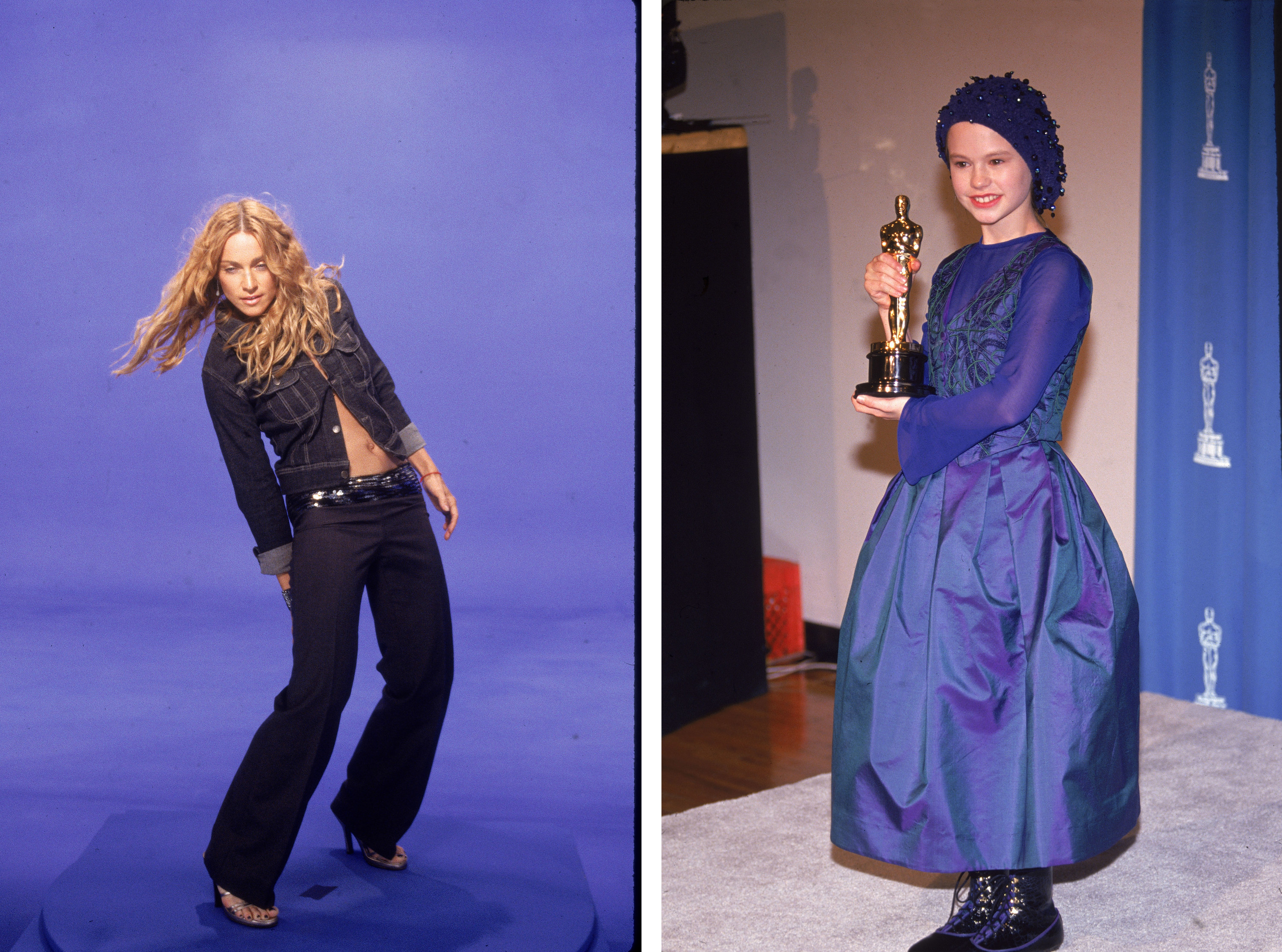
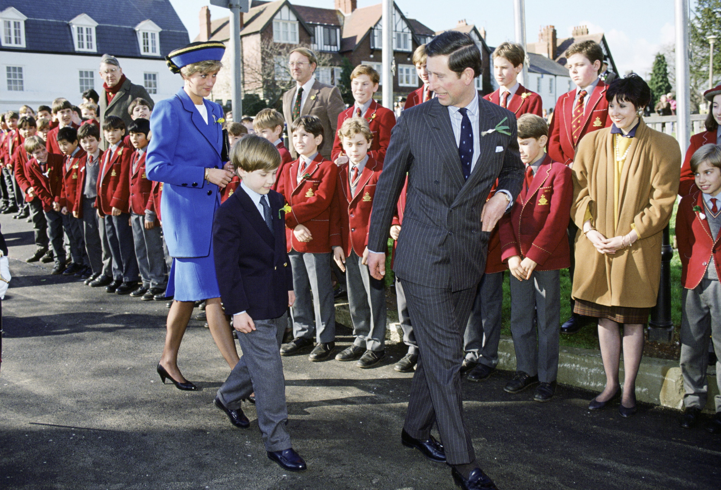
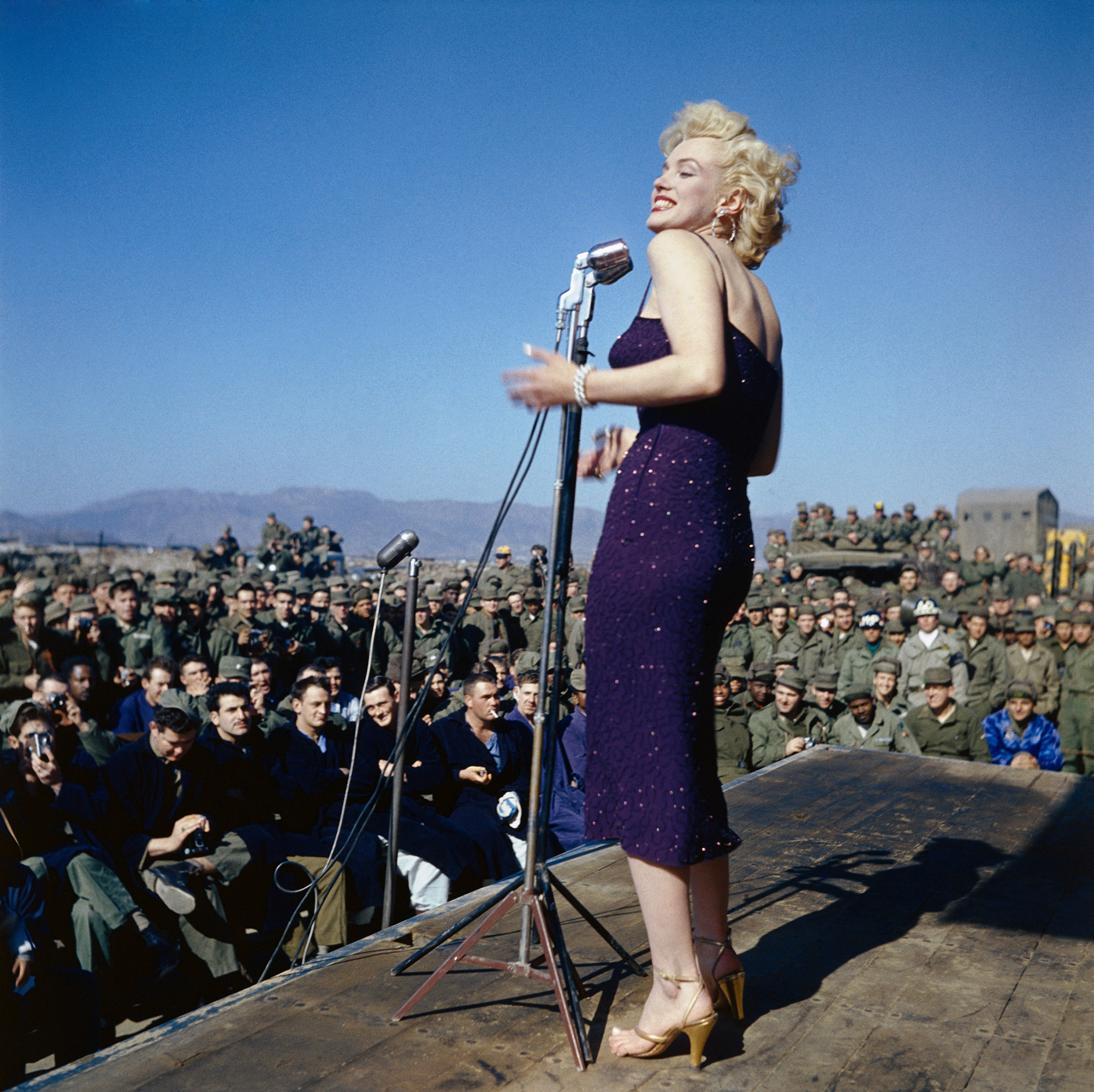
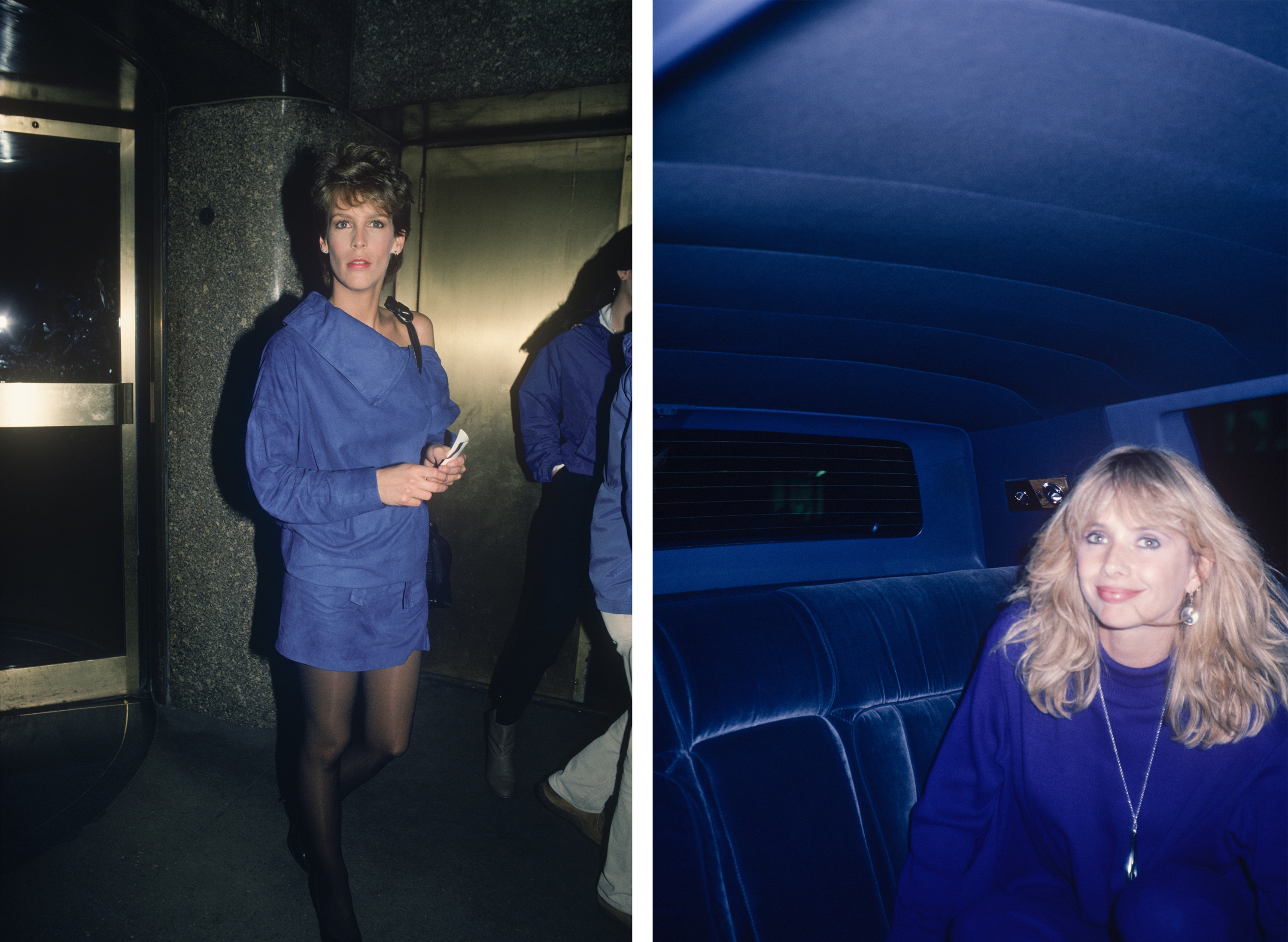
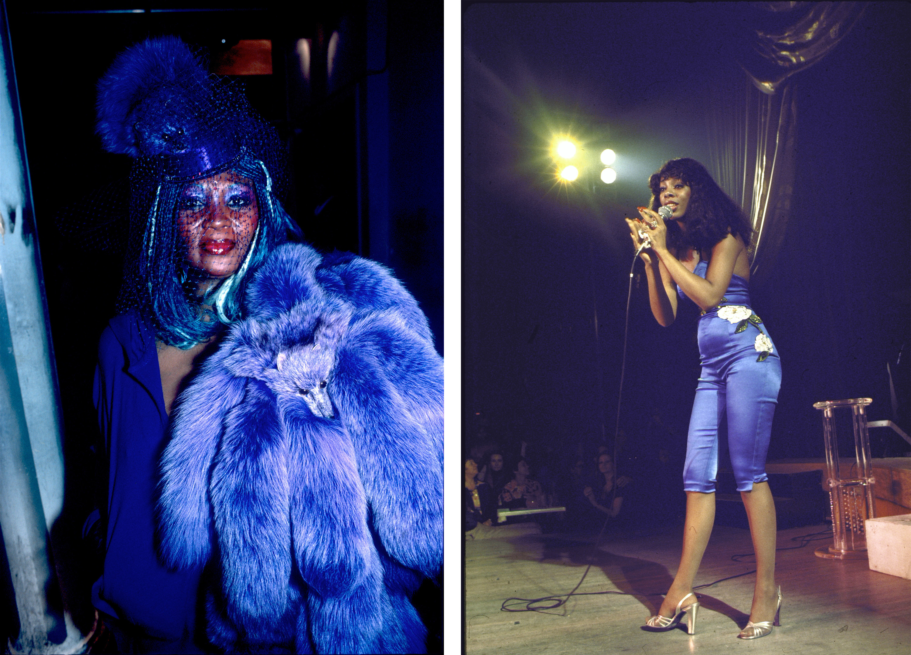
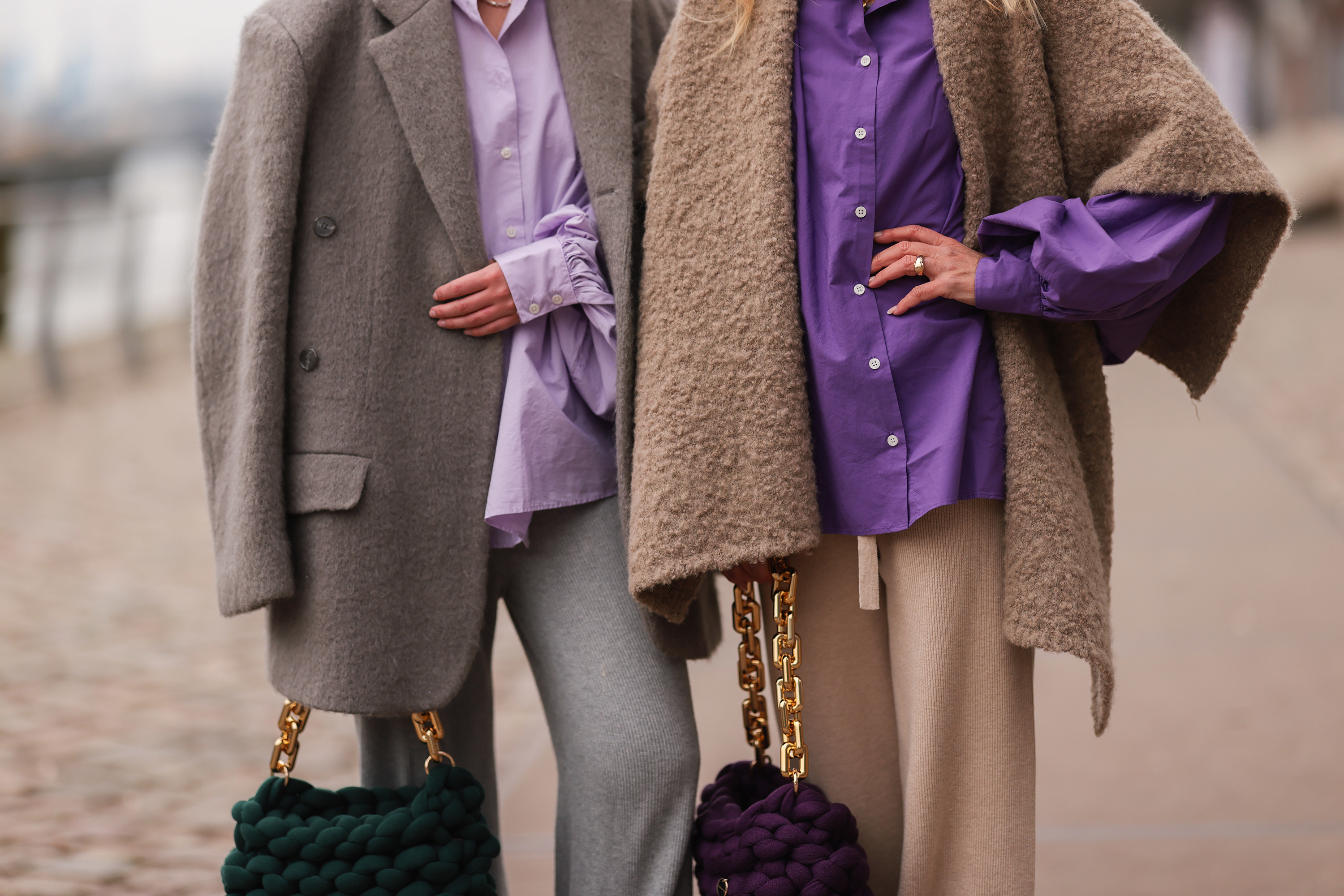
At first, I was sure I'd seen this color only recently — periwinkle and its lighter-colored sibling lavender had taken over my Instagram feed in the last year. The more I started to look for it, the more I saw periwinkle everywhere. Princess Diana was seen in periwinkle more than once, as was Queen Elizabeth, and it has shown up multiple times on the red carpet over the years.
In the company’s announcement, Pantone said: "We are living in transformative times. Very Peri is a symbol of the global zeitgeist of the moment and the transition we are going through."
According to Pantone, the color will help us bridge the gap between technology like the metaverse and other online worlds as it "illustrates the fusion of modern life and how color trends in the digital world are being manifested in the physical world and vice versa."
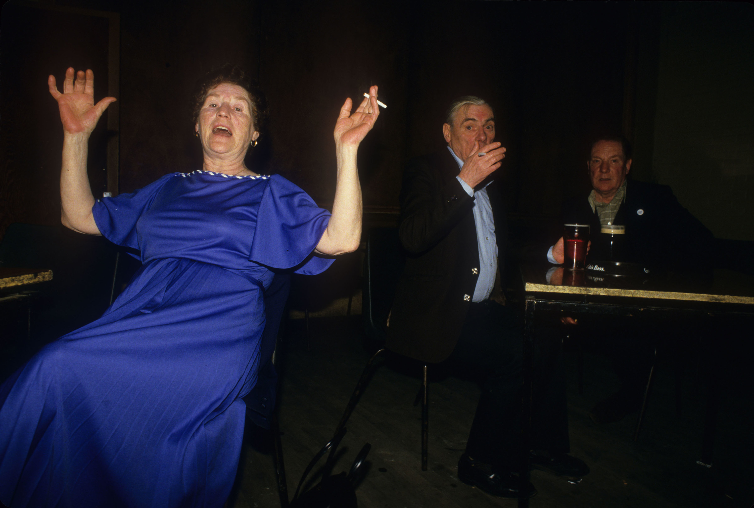
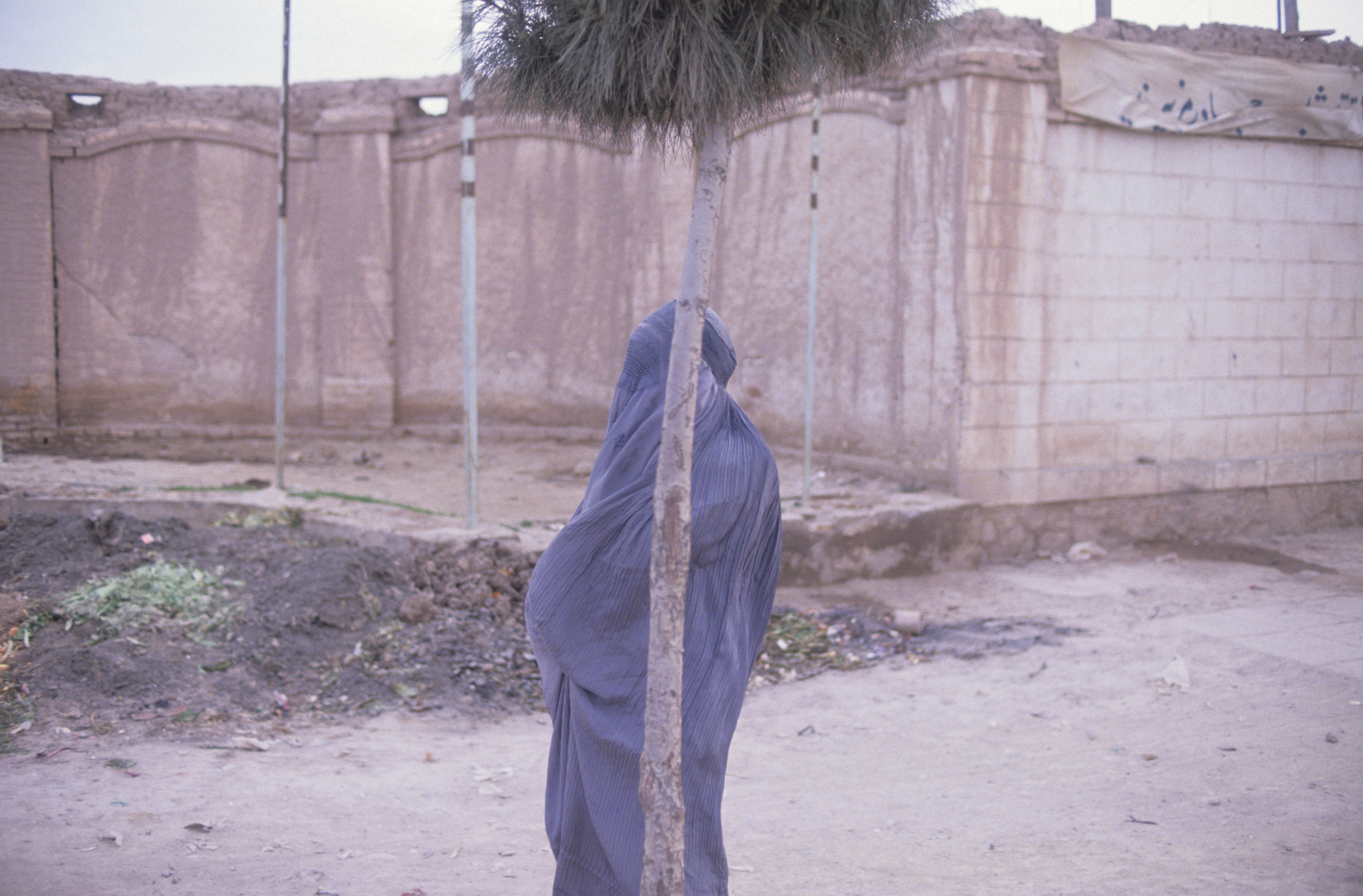
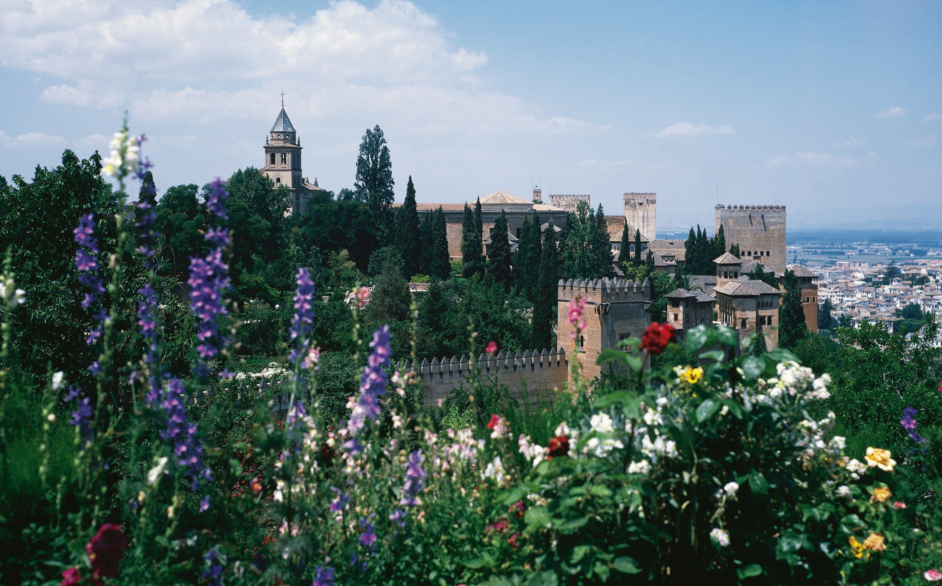
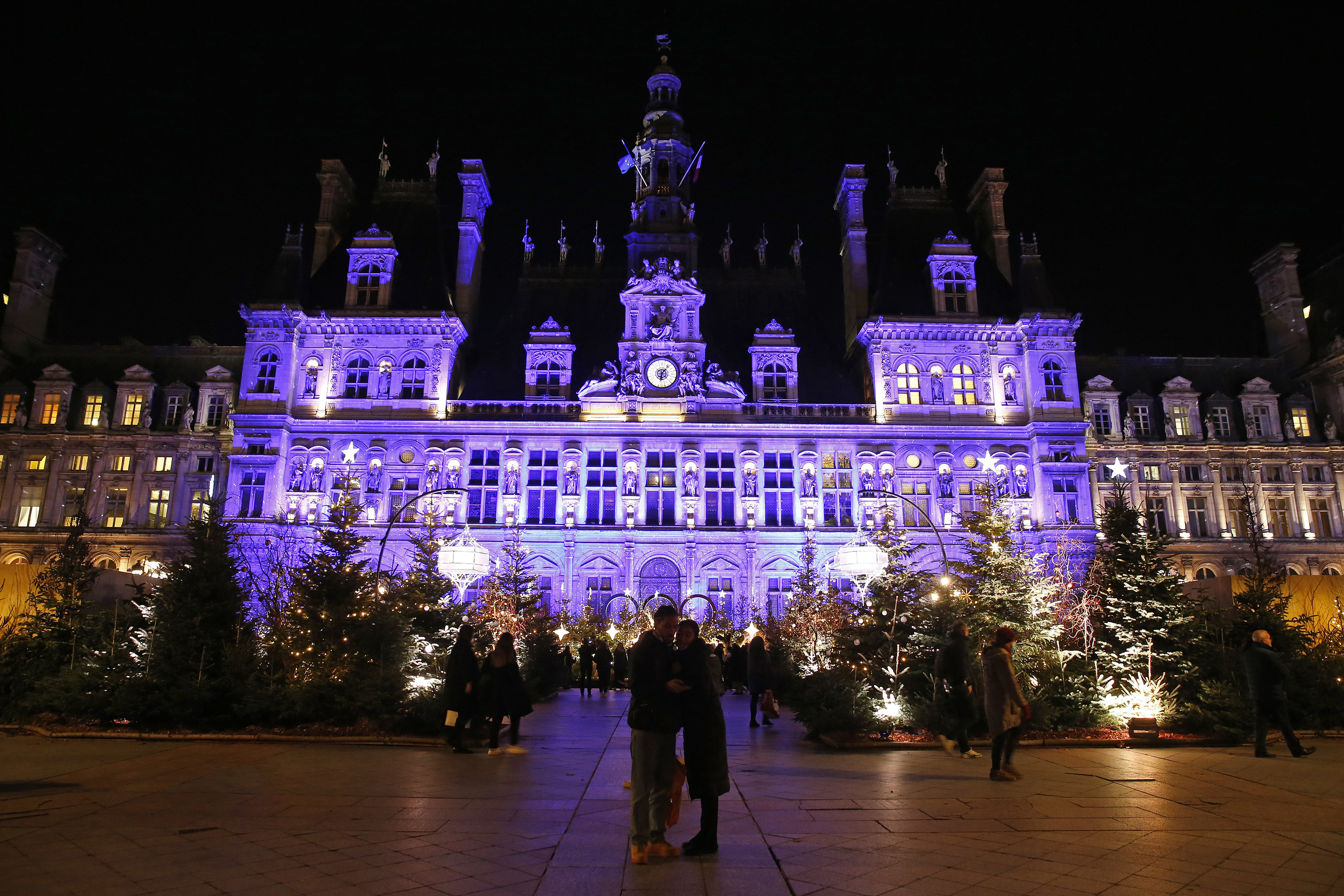
We put together some photos of periwinkle (and maybe also some violet) to bring you some inspiration for the coming color year.