

Note: This post no longer being updated.
COVID-19 has now taken hold in every US state. Responses have differed too — testing rates vary widely from state to state, and there is huge variation in policies to limit the spread of the disease. Use the charts and maps below to find out how your state is dealing with the crisis. The data will be updated daily.
1. How hard has your state been hit?
Total death rate by state
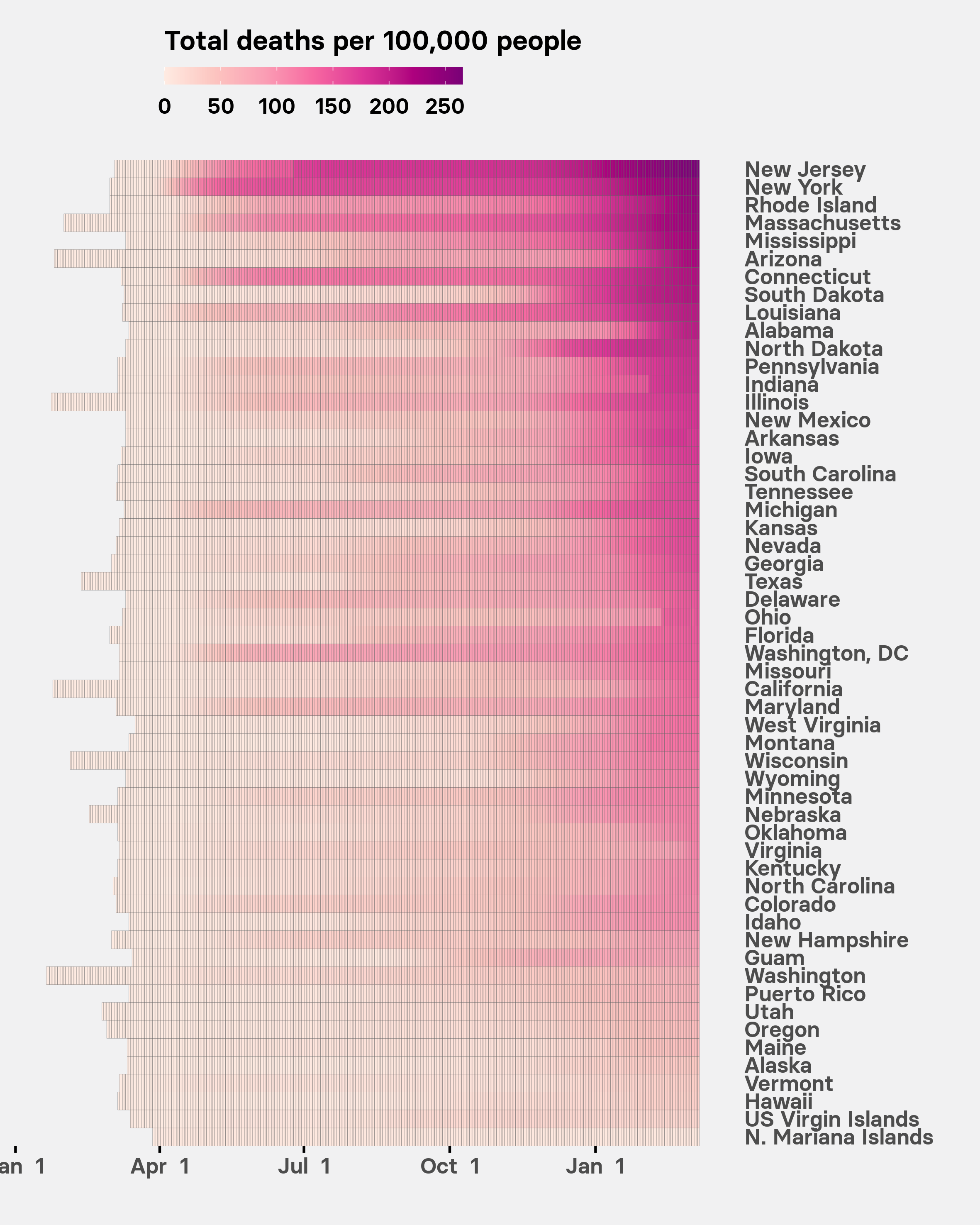
This chart shows how the total number of deaths in each state has risen over the course of the epidemic, using data compiled by the New York Times. Tiles are colored by the number of deaths relative to the state’s population, including “probable” COVID-19 deaths — based on symptoms and exposure to the virus, without a positive test result — where these are available. The states are sorted by their current total number of reported deaths per 100,000 people.
Daily death rate by state
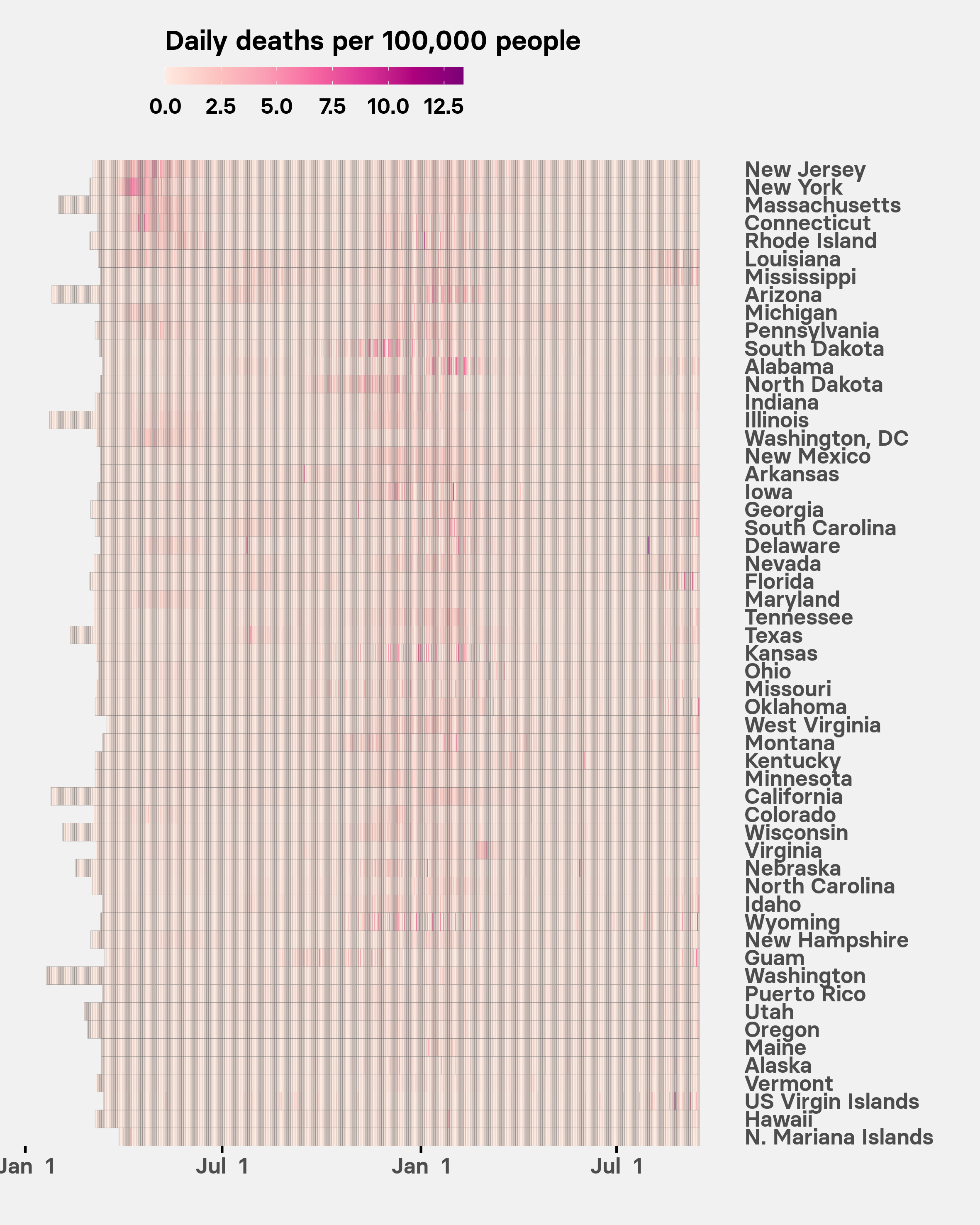
This chart shows the number of reported deaths relative to a state’s population on each day of its outbreak. The states are again sorted by their total death rate. If the tiles for any state start to get lighter over time after a period with more intense colors, it suggests that its epidemic is starting to come under control.
2. How many tests has your state run?
COVID-19 testing by state
The key to understanding how far COVID-19 has spread through the population is to test people with flu-like symptoms. The US was late to start widespread testing, and there is still huge variation in its extent from state to state.
This chart gives the latest testing data for each state, including the percentage who tested positive, compiled by the COVID Tracking Project. Search for your state or sort the data by clicking on each of the column headers — click once to sort in ascending order, or twice to sort in descending order.
Testing rate versus % positive by state
This chart helps put into perspective the numbers on the percentage of people testing positive in each state.
3. What has your state done to limit viral spread?
State policies to limit the spread of COVID-18 are being tracked by the Kaiser Family Foundation, a health policy think tank based in San Francisco. Some states have begun to roll back some of these measures, allowing businesses to reopen, ending stay-at-home orders, or easing restrictions on dining at restaurants.
You can also use this COVID-19 tracker to track the epidemic at the national level for the US.
UPDATE
The COVID Tracking Project, which provided the data used for the final two charts, stopped collecting data on Mar. 7, 2021. We have now stopped updating this post. When this piece was first published, % positive values were calculated from positive and negative test results. At the time we ceased updating, % positive was a cumulative measure of confirmed plus probable COVID-19 cases divided by the sum of this number and the COVID Tracking Project's best estimate of the number of people who had tested for COVID-19 but only ever received a negative result.
UPDATE
The charts showing tests per 100,000 people now reflect completed tests only. Previously they included tests for which the results were still pending.