

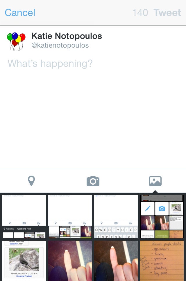
I have a few rarely used Twitter accounts connected to the Twitter app on my phone. Yesterday I opened one for the first time in a while, and saw something strange. Because those accounts are inactive, Twitter seems to be serving up a different, more newbie-friendly interface.
And not just one: On another little-used account, I got yet another posting interface. In addition to the main posting interface, there seem to be two newbie interfaces: one for accounts that mostly post text and one for accounts that are used mainly to post photos.
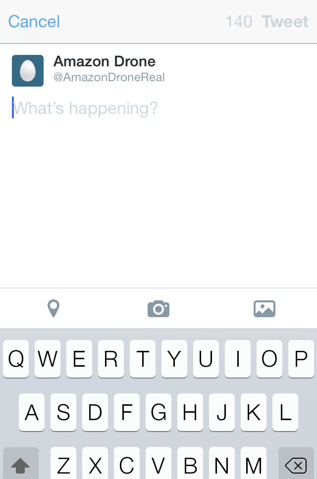
[I would like to clarify that my @AmazonDroneReal account is purely an ironic parody of a parody Twitter account. I demand that my reputation of not being a bad-parody-Twitter-account-maker remain intact during this discussion. Thank you.]
Three different interfaces for the "compose tweet" screen for three accounts, all on the same phone:
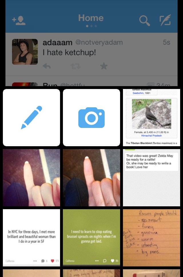
The middle one is particularly interesting. It offers a large pencil or camera option instead of taking you to the compose screen right away. It's almost Tumblr-like.
This type of testing isn't new. Instead of rolling out major changes to all of their users at once, companies routinely test new layouts and features in small batches. We even do that here at BuzzFeed when we're testing new layouts on our site. A random 5% of users might see a new layout change, which gives our developers a chance to see how well it works. This is pretty standard.
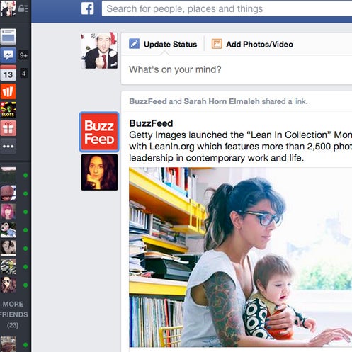
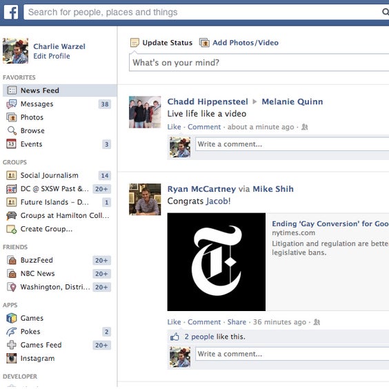
Over on Facebook, a colleague sitting next to me has had a very different looking version of the homepage for several months. He also has a completely different looking Spotify.
Facebook is currently serving up at least two versions of its homepage:
We've become somewhat used to the face that some of our friends will have the "new Twitter" or "new Facebook" before us, that these rollouts happen piecemeal. But when there's constant A/B testing going on, it's getting hard to tell which, if any, version is actually standard.
Some of these changes are major, transforming updates! The new version of Twitter, with its large type and white layout, rolled out over a period of a few weeks, according to no obvious pattern. During that period, you never really knew if you were in the minority or the majority, in the future or in the past. Were you on the wrong one? Were most other Twitter users logging into what is essentially a different site?
It's a strange new feeling, and one that's going to become familiar: that everybody's internet looks and works differently, even if we're using the same sites.