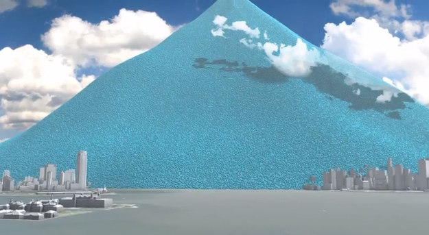
TechWhat New York City's Carbon Output Would Look Like If You Could See ItOne day, one month, and one year, visualized as pure balls of carbon dioxide. Spoiler: it's a lot of balls.By by John HerrmanBuzzFeed StaffPosted on November 21, 2012, 3:39 pmTwitterFacebookLink Here's a strange, but cool, animation from CarbonVisuals: View this video on YouTube This is a day's worth of New York carbon emissions, shown as spheres of pure CO2 And a month And a year