
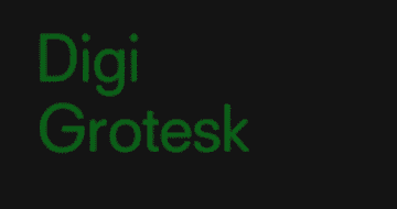
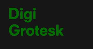
Before Arial and Segoe, before Comic Sans and Courier, there was Digi Grotesk. Designed by a German guy named Rudolph Hell (or more probably his employees), this is the first true digital typeface.
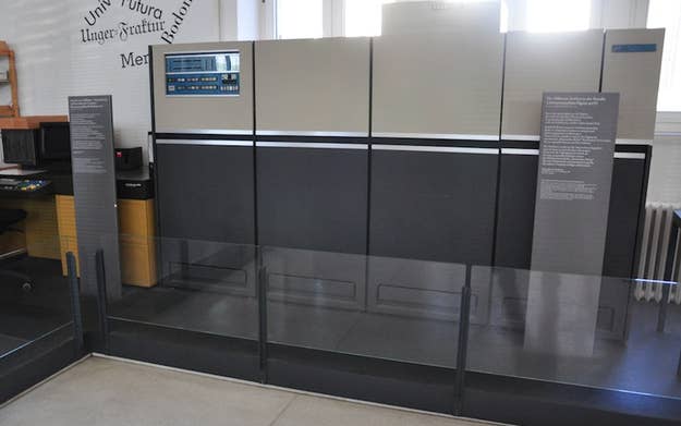
Digi Grotesk wasn't exactly intended for display on computer screens, which didn't exist as we know them in 1968. Instead, it was designed for use in Hell's pioneering cathode ray typesetting machines, which set text by projecting a CRT image — basically a TV image — onto photosensitive paper through a lens. The machines looked like this:
Digitizing this part of the typesetting process was a huge boon to typesetters, because it meant they could set hundreds, or even thousands, of letters per minute. The machines were the first to store fonts as bitmap images, and this was the first font designed specifically for digital use. Here's the heavier version, which looks a bit like Helvetica:
It holds up well because most fonts hold up well; if they weren't designed decades or even centuries ago, they're probably based on typefaces that were. Segoe, the font used all over Microsoft Windows, is a riff (or maybe rip) on Frutiger Next, the parent font of which was released in 1968. Times New Roman was developed in 1931. Digi Grotesk was released in the '60s, but apparently mimics a typeface called Neuzeit Book, which was first designed in 1928. I wouldn't blink if I saw this font on a website today.
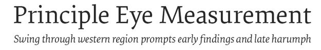
On the other end of the spectrum, take this font, which was designed in 2011 and is used for reading on ultra-high-resolution gadget screens. It could've been carved out of wood in 1750, right? But it wasn't. Fonts are timeless.
(You can take a closer look at the Digi Grotesk font family here.)