
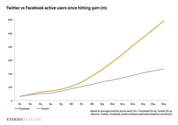
Twitter has publicly admitted it has a problem with its "onboarding" process. This chart by the European research firm, Enders Analysis shows just how severe it may be.
The chart, which tracks Twitter's monthly active users against Facebook's since hitting 30 million users, clearly illustrates Facebook's extraordinary growth as well as its ability to keep its users coming back to the site. Twitter's trajectory has maintained a somewhat steady, but relatively slow rate of growth.
While there are surely a number of reasons for this discrepancy — Facebook and Twitter are very much different platforms with different use cases — the chart is proof that, while signing up new users may not be too difficult, getting them familiar with the site and bringing them back to the network is a struggle. This is due much in part to the steep learning curve of Twitter's "onboarding" process and the amount of time and energy required to build a valuable network on the platform. It's not that there's a lack of interest in Twitter, it's that users aren't exactly sure how to proceed once they've created an account.
Twitter CEO Dick Costolo has made it clear that fixing the "confusing and opaque" language and ecosystem of the signup process is a primary focus for the social network in its first year as a public company but you only need to look at the chart to see how the network has suffered as a result.
(h/t @IanMaude for the graph.)