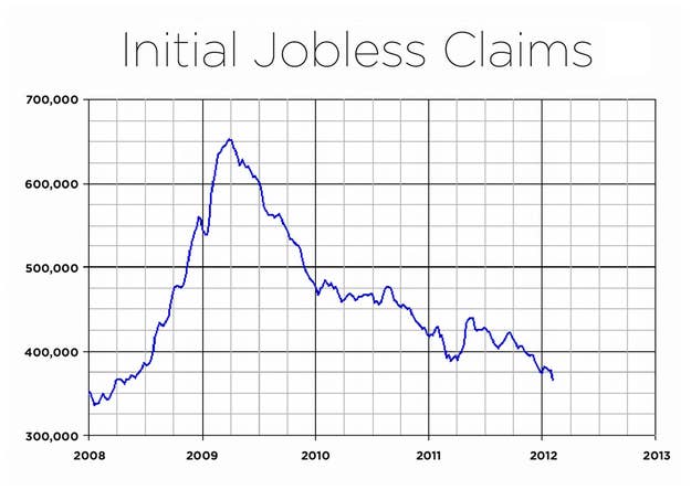
One Chart Explaining Why It's Getting Hard To Blame Obama For The Economy
This chart tracks the four-week moving average of initial jobless claims, beginning in January of 2008. And while the economy isn't booming, it's a vivid illustration that the labor market has, on Obama's watch, been healing.