
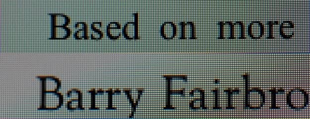
The iPad mini is selling like ice cream in hell. Exit interviews placed the number of Minis sold this past weekend at around two-thirds of the total — almost 2.7 million of the 4 million sold. But publishers are now faced with a difficult decision, stemming from a small but important detail: There is no simple, future-proof way to tailor the designs of their apps and websites to the Mini’s 7.9-inch screen. That means things that are perfectly readable on the iPad's 9.7-inch screen might be a little too small to see clearly when they're translated to the iPad Mini's 7.9-inch display.
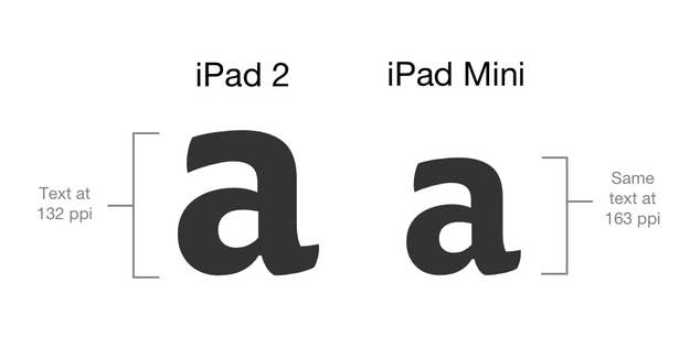
Apple has chosen not to distinguish the iPad Mini from the larger iPad in user-agent strings sent to websites, and the company has not publicly stated if developers will be able to target the iPad Mini through native APIs (the release notes for beta versions of these APIs are currently under NDA). There's no easy way to tell, either, since the iPad Mini's screen resolution is 1024x768, the exact same as the original iPad and iPad 2 — the latter of which is still shipping.
The unofficial word, according to multiple sources close to Apple who asked to remain anonymous, is, “If it’s too small on the Mini, it’s too small, period.” In other words, if app interfaces and text are too small on the Mini, developers simply need to make them bigger — resulting in bigger assets on both the mini and the regular iPad. Were Apple to allow Web and app developers to specifically target the iPad Mini, some would inevitably create entirely different experiences for it. The company appears to be sticking to its guns in order to follow through on its stated promise of “less of it, but no less to it.” An iPad Mini is supposed to be an iPad, just smaller.
Letting developers choose to target the iPad Mini could unleash a world of horrors upon the device's users, and Apple. Without clear guidance as to how the form factor should be treated, some publishers might try to retrofit their existing iPhone-optimized websites to the larger form factor — which has been common with 7-inch Android tablets, resulting in what are essentially gigantic phone apps — while others would bastardize their iPad-optimized layouts in order to make the text legible on the Mini. In addition to confounding existing users, allowing developers to treat apps and websites on the smaller device as anything other than real iPad apps could severely dilute the iPad Mini's positioning as a smaller iPad, not a larger iPhone. (The "it's just a big iPhone" criticism is one reason John Gruber thinks it was necessary to build the big iPad before the iPad Mini.)
The best option for publishers who wish to provide the best possible user experience might be to allow the user to change the font size in the app’s settings and in article pages on the Web. Evan Doll, cofounder at Flipboard, is unconcerned, saying, “Most apps don’t need to do anything.” Apple generally does not offer immediate guidance on all design questions relating to new hardware.
Doll did note, however, that Flipboard would be making their font settings easier for users to find.